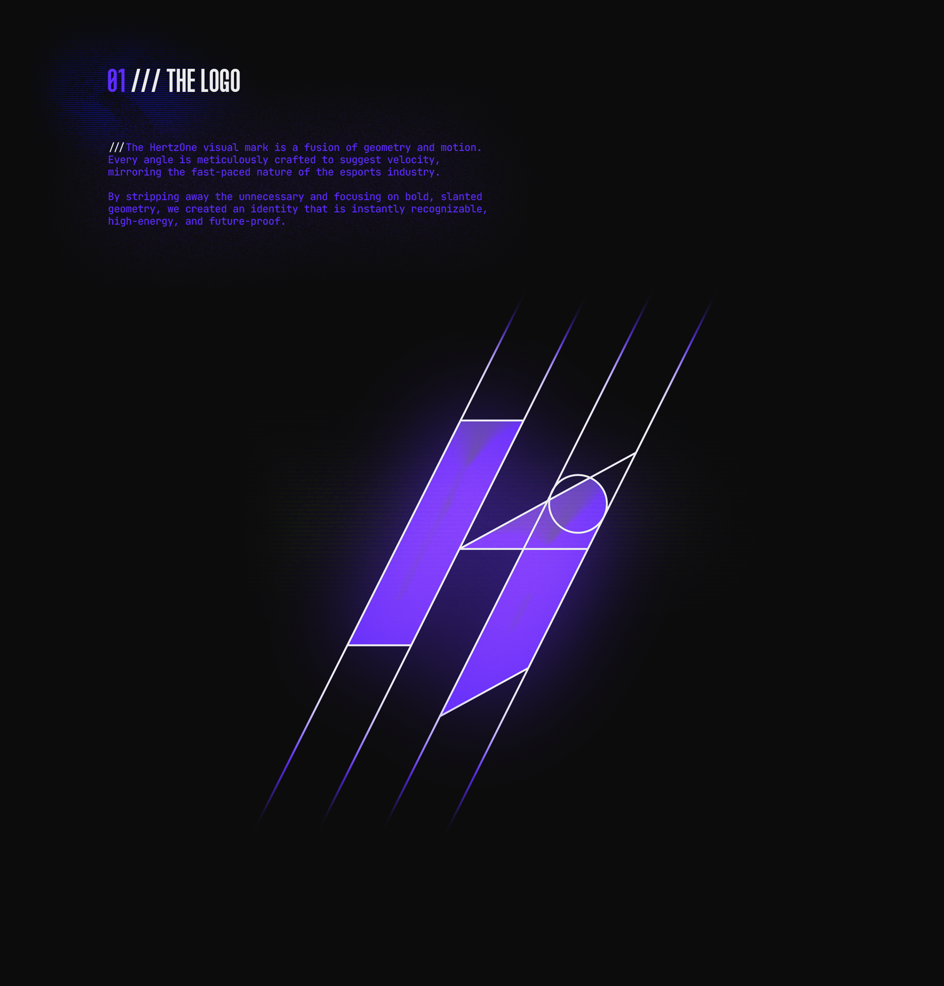
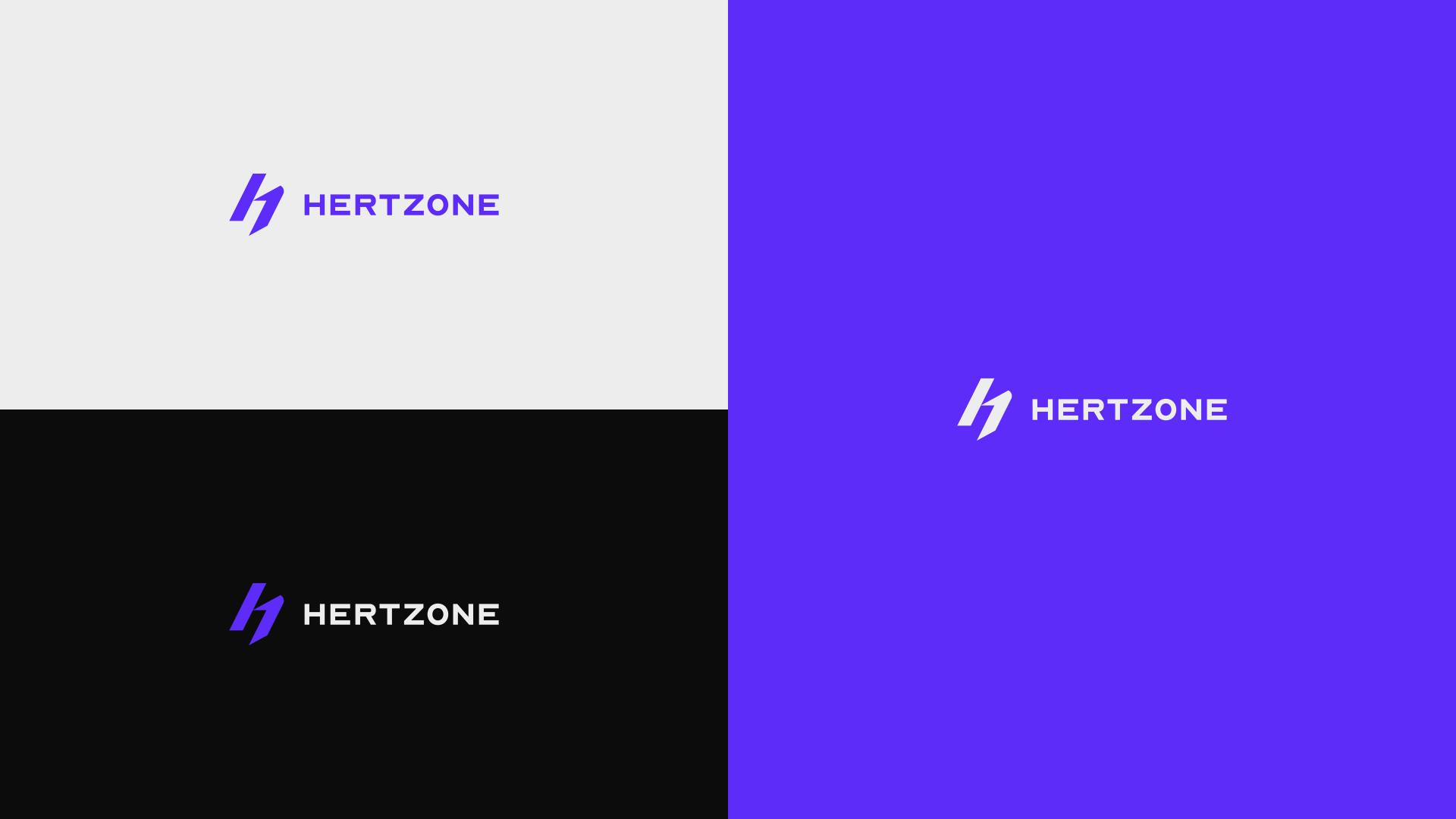
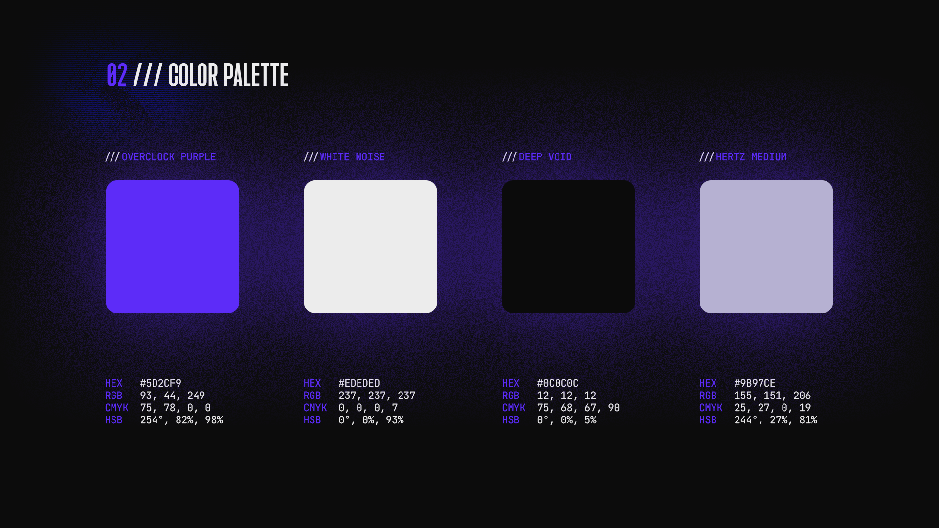
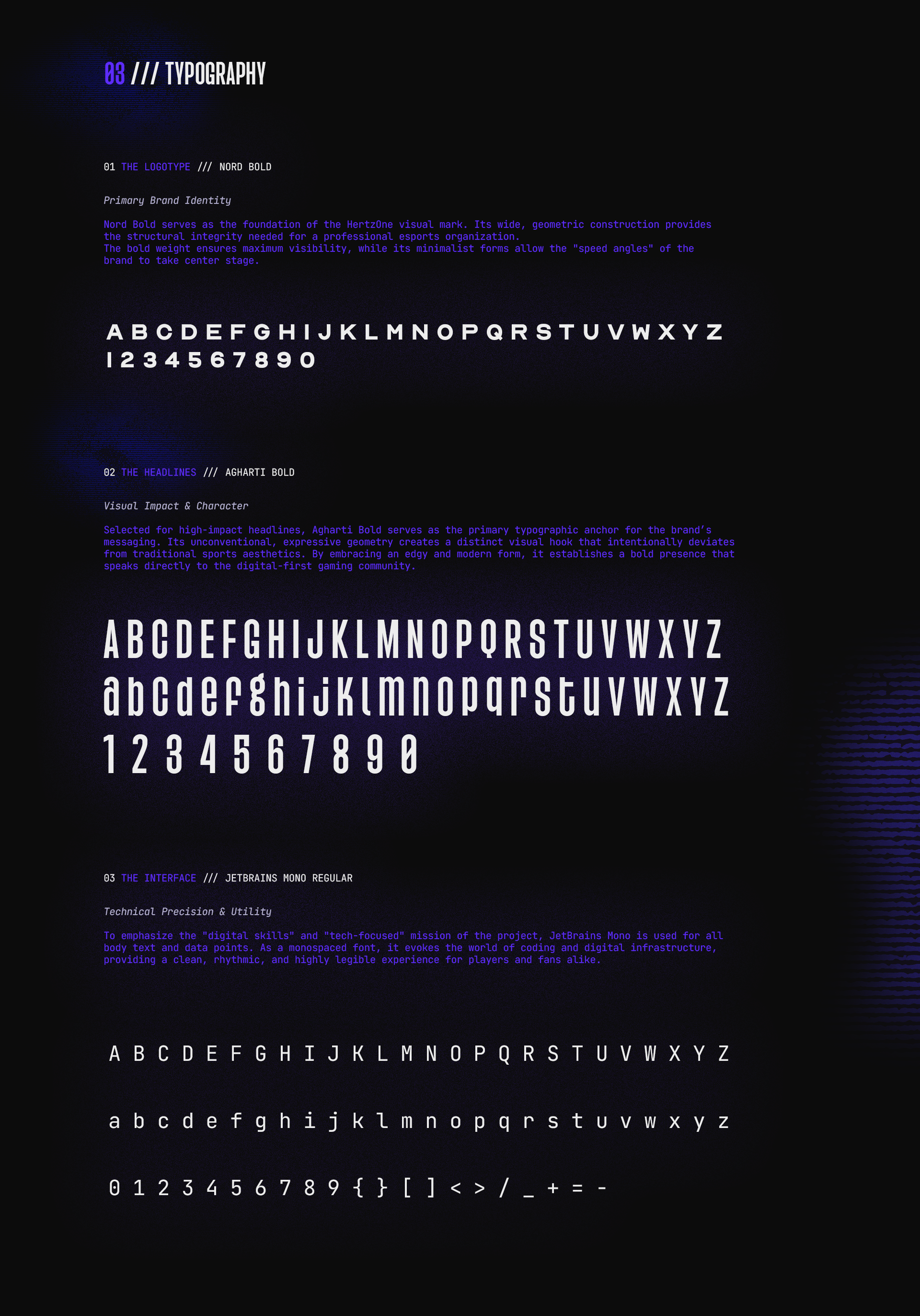

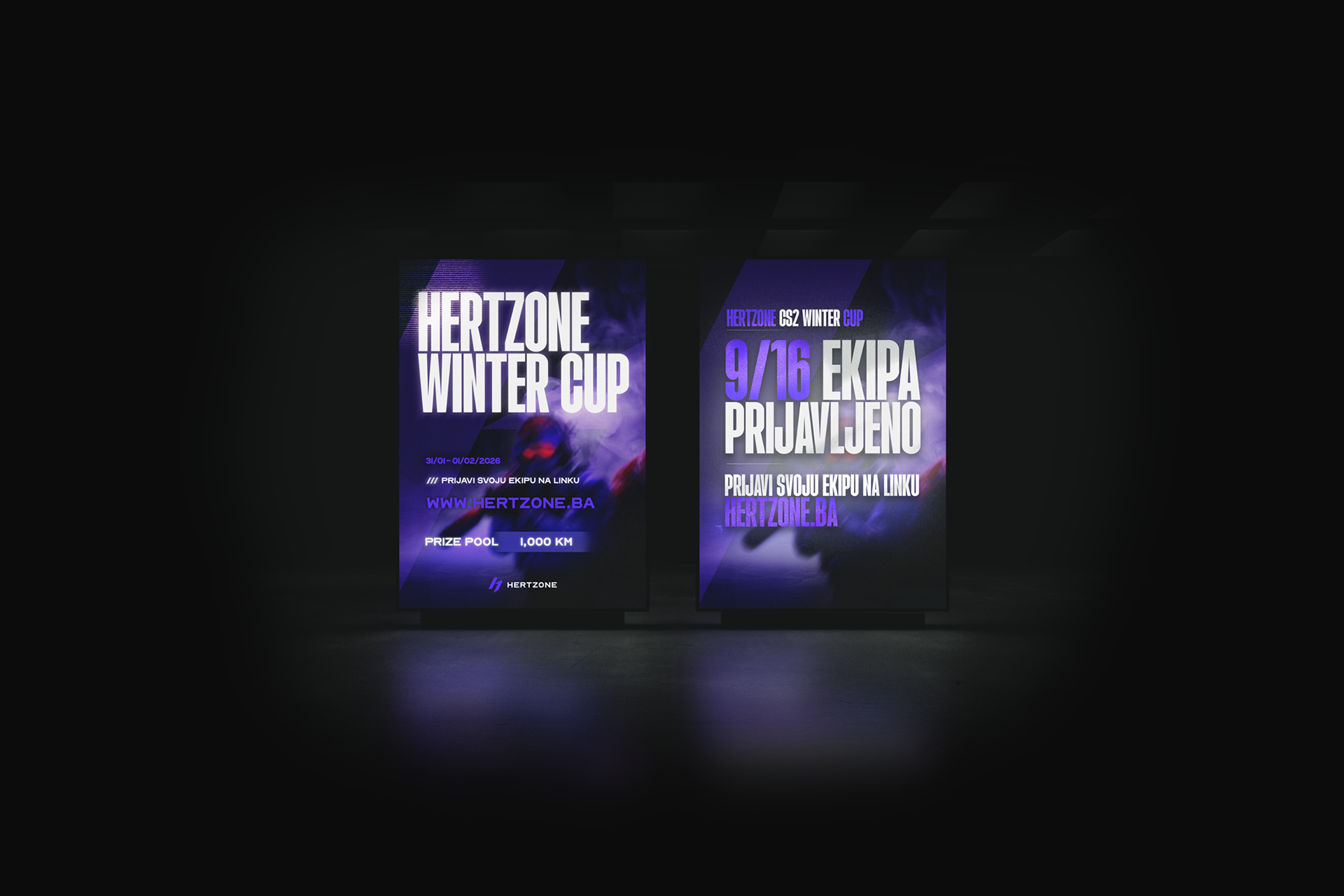


HERTZONE is a visual identity project rooted in the concept of frequency and high-impact energy. The brand identity centers around a sharp, geometric monogram that mirrors the dual nature of technology: precision and power. By utilizing a high-contrast palette of deep obsidian and electric violets, the visual system creates an immersive atmosphere that feels both futuristic and grounded. This case study explores the logo architecture, color theory, and environmental applications of a brand built for the next digital frontier.